To the power of…
The 4th Australian Poster Annual asked designers to consider a multidimensional brief, responding to the festival manifesto, ‘Strength in Numbers’. Continue Reading →


The 4th Australian Poster Annual asked designers to consider a multidimensional brief, responding to the festival manifesto, ‘Strength in Numbers’. Continue Reading →
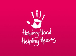
The logo and stationary suite for Helping Hand Helping Hearts based on the handwriting of one of the sisters who started the charity. The colour choice was very personal to the sisters and the handprint was indicative of the activities the charity supports.
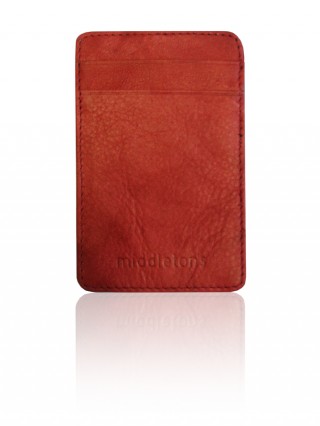
A creative range of corporate merchandise developed with considerable budget restrictions.
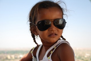
In September and November 2008 we had a “girls own adventure” through India.
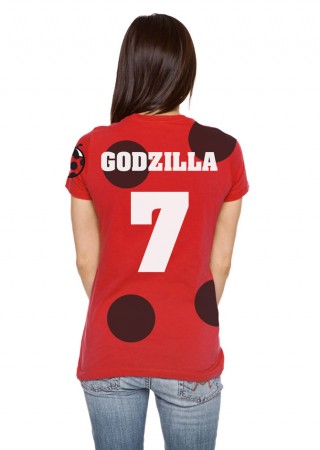
Logo and shirt design for local indoor soccer team The Killer Ladybirds. This evolved into a home and away shirt design. Fun and broken toes ensued.
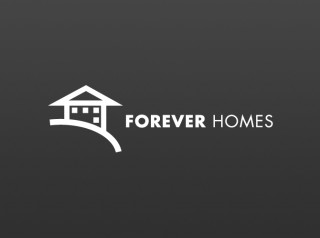
Logo for a small building company in far north Queensland. The logo is based on the side view of the builder’s own house situated high on a hill overlooking a lake.

The UK recruitment campaign was developed with the brief “what do expats really miss?”.
Feedback from Michael Page indicated that the adverts had been highly successful. Part of their success could be due to the fact they were published during the UK winter.
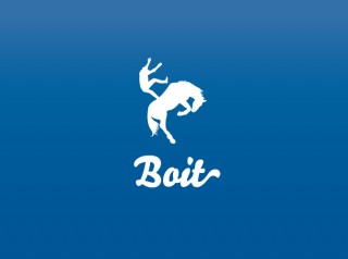
Logo for fictional clothing label. It was based on a conversation I had with my brother about hitting stages in life when you feel like you are reaching a new level in a computer game. Boit, boit, boit.

Logo and business card design for freelance journalist and photographer Lea Coghlan.
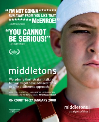
The 2008 Australian Open ad campaign was developed under the theme of “The Middletons Tennis Tantrum Festival”
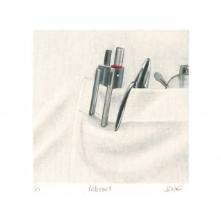
Illustrations commissioned as artwork for the new CSIRO offices at Clayton in Melbourne. Each was to represent a different area of science that the Clayton division practiced.